Angelo Esquivel

Client
DAVIS FOOD CO-OP
Community-owned grocery store branding and environmental graphics system
Scope
Brand Identity · Environmental Graphics · Illustration System · Campaign Design
Role
Branding, signage systems, illustration, marketing graphics
Collaboration
My relationship with DFC is a little unusual. I was a board member for three years while also working as their designer — which meant I understood the financial pressures and strategic challenges from the inside, not just the creative brief.
As part of the Strategic Planning Committee I helped commission a market study in 2023 that confirmed what we were seeing in the numbers — the brand wasn't connecting. That research led to bringing on a new marketing manager in 2024 with real retail experience.
Working with Lili has been one of the most grounding creative relationships I've had. She knows what she wants, she pushes back when something isn't right, and she cares deeply about the community the Co-op serves. My job is to translate that clarity into work that lives in the space. When it works, you see it in the numbers.
Overview
The Davis Food Co-op was ready for a brand refresh that reflected who they are today—community-driven, values-forward, and approachable—without losing the trust and nostalgia they’ve built over decades. This project became a multi-phase collaboration focused on clarity, connection, and real-world impact inside the store.
The Challenge
-
Brand messaging wasn’t reaching shoppers clearly
-
Signage was visually overloaded and inconsistent across departments
-
The Co-op needed modernization without losing its neighborhood feel
The biggest issue wasn’t aesthetics—it was communication.
The Approach
The process began by setting assumptions aside and listening—to staff, stakeholders, and how people actually move and shop in the store.
The goal was to create a visual system that felt warm, legible, and human. One that balanced nostalgia with clarity and helped the brand speak more clearly to its community.
Collaboration with stakeholders was essential. Their insights shaped decisions at every stage and ensured the work felt authentic, not imposed.
Outcome
The rebrand was met with positive community feedback, and the updated identity supported a range of marketing strategies with measurable results:
-
+15% year-over-year meat department growth
-
+22% peak beer & wine sales increase
This demonstrated a direct link between the refreshed branding and increased customer engagement.
The project’s success was amplified by the collaboration with Co-op stakeholders, whose insights brought clarity, authenticity, and purpose to the final identity.
Identity Exploration
Identity explorations focused on preserving recognizable elements while modernizing the brand’s visual language.


Visual Language
A flexible visual language was created to support signage, print materials, and campaigns across the store.


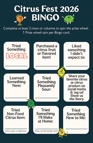
Illustration System
Illustrated elements were introduced to humanize the brand and create a recognizable visual vocabulary throughout the store.


.png)


Department Rollout
The system was first implemented in the Meat Department and later expanded across the store.


Editorial & Print Communications
The visual system extended into print communications used to promote events and weekly specials.


Community Campaign
Playful illustrated graphics were developed to promote the Co-op’s annual Cheese Madness tasting event.


Seasonal Engagement
Seasonal illustrations and stickers helped extend the brand identity into community events and promotions.